I figured when I wrote recently about main and ending title sequences that I couldn’t find a more arcane topic of film-geek fascination beyond that.
I realized I was incorrect when I remembered that the very use of subtitles within a movie can be its own thing.
Most of the time when a scene requires a subtitle, it’s to identify a location or establish the time or date, or to translate foreign language dialogue. Typically the text is white or yellow and appears at the center bottom of the image.
Rarely is any design thought put into the art of subtitles beyond the plain font, but below are some examples where some serious thought was put into the deployment of title cards and subtitles.
These few choice films push the art of movie subtitling to the next level.
To Live and Die in L.A. (1985)
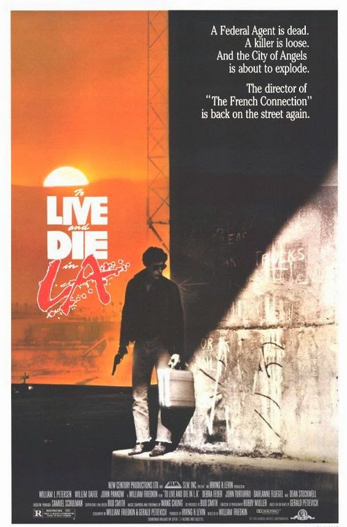
As this labyrinthine crime epic jockeys around Los Angeles, subtitles identifying the scene and the time of day are rendered in alternating fonts—digital readout, classic typewriter, handwritten cursive.
Towards the climax, just before a pivotal plot twist, when every urgent moment counts, we see the numbers representing a digital clock ticking away in real time second-by-second. The shifting typography throughout the movie has no apparent rhyme or reason to it, but it’s just one of the film’s many stylistic flourishes.
The Hunt for Red October (1990)
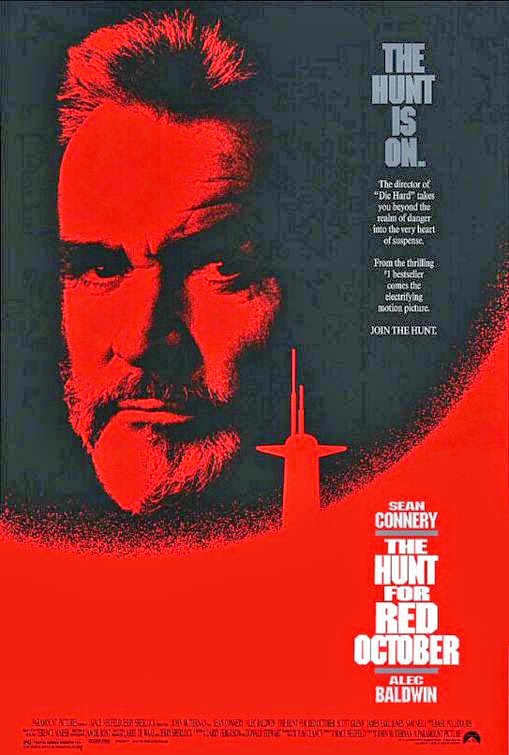
The screenplay for Tom Clancy’s techno-thriller frequently bounces around the globe, and to help us keep track, green text simulating a digital readout explains to the viewer the where’s and when’s while the sound of tiny electronic blips and bleeps is heard on the soundtrack as the titles are typed out word-by-word.
It’s a style that has since become a staple of the Bourne Identity movies as well as other similar spy thrillers. In a subtle bit of reinvention, director John McTiernan permits the plain white translation subtitles to flirt with the wider aspect ratio of the Panavision frame, freed from the constraints of the center bottom of the screen—early on, two characters on opposite edges of the frame conspire in hushed tones, and it’s easy to keep track of the conversation because the accompanying subtitles are rendered on their respective sides of the widescreen frame.
The Royal Tenenbaums (2001)
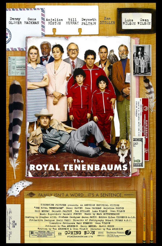
Wes Anderson’s films have a distinctive storybook look and style that are immediately recognizable as his signature.
His pictures are glorious masterworks of colorful production design, some subtle (Tenenbaums; Moonrise Kingdom) while others are delightfully over-the-top (The Life Aquatic). Integrated into the Anderson aesthetic is a consistent style of using onscreen captions and title cards that blatantly ignores what was once an industry-standard “safe area”—that little extra bit of elbow room that indents the text into the image so that no matter how poorly calibrated your theater projector or your home television set, the words in the corners would usually all be legible without anything being cropped out of the frame.
Poor aperture settings during projection or over-scanned video transfers can result in, say, the 2009 reboot of Star Trek taking place in such locations as “Ulcan” and “Owa,” or a presentation of Moonraker that stars actor “Oger Moore as Ian Fleming’s James Bond 00.” The title cards in Anderson’s films embrace the full breadth of the widescreen canvas, defying the traditional “safe area” and taking for granted that your monitor at home is properly aligned down to the pixel.
Johnny Dangerously (1984)
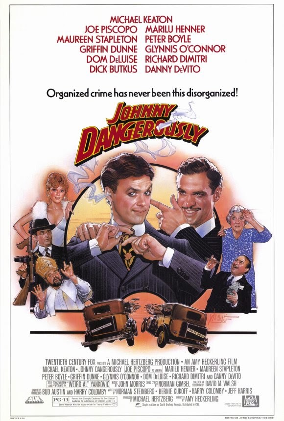
This gangster spoof from the director of Fast Times at Ridgemont High was intended to do for The Godfather what the Zucker/Abrams/Zucker comedy classic Airplane! did for all-star disaster movies, though it never attains the same delirious heights of lunacy.
Still, among my favorite throwaway moments is a slapstick sight gag that pokes fun at the convention of subtitles, involving bold white numerals identifying the urban street scene as set in the year 1935; the numbers are ultimately smashed to bits by a car plowing into the frame.
Austin Powers in Goldmember (2002)
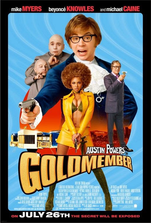
Juvenile sexual and scatological innuendo are the forced punchlines of a laborious sequence that demonstrates what could possibly get lost in translation when onscreen subtitles are misread because chunks of text can sometimes become obscured when they inadvertently blend into elements of the scenery.
Words and parts of words are rendered invisible in the subtitles and so we’re reading something gross or naughty until, say, a prop is removed or a sliding bookshelf is pushed aside and now that the newly revealed letters and words have filled in the blanks, the translation is no longer such a naughty exchange after all but is, in fact, rather innocuous. Much fun is had over phrases like “eat shiitake mushrooms,” for instance.
Like I said: forced.
Mission: Impossible – Ghost Protocol (2011)
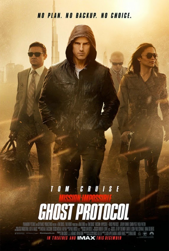
M:I-4 contains a few wink-nudge jokes involving subtitles, including a sequence where translation text accompanying a televised Russian news report switches over to English mid-sentence for the benefit of the audience.
Yet another playful gag of language and typesetting involves the substitution of a string of punctuation marks to censor the subtitled translation of a profane Russian exclamation.
Fay Grim (2006)

Parker Posey stars in this amusing if uneven bit of European romantic intrigue, but the most memorable aspects of the film are its incessant canted camera angles (any level horizons in this movie are few and very far between) and the prominent title cards that are so huge the text fills up the entire frame.
Quantum of Solace (2008)
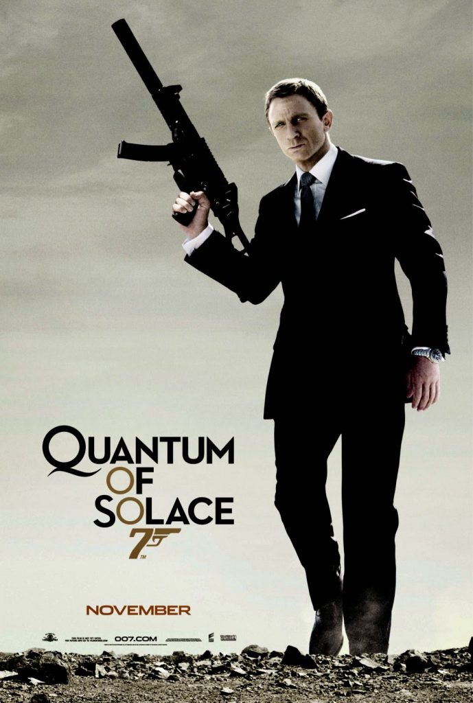
The cinematic shorthand of using onscreen subtitles to identify new locations is a convention usually credited to the globe-trotting James Bond series, though you’d be surprised how few of the early 007 films actually use subtitles—the makers of ’60s-era classics like Goldfinger, Thunderball and On Her Majesty’s Secret Service found clever and economical ways to identify their exotic locales without resorting to superimposed text.
All this to say: if you’re going to go with subtitles at all, do it just like the sleek titles used throughout Quantum of Solace. I’m not a big fan of what Mk12 created for the main title credits sequence, but the stylish interstitial title cards and foreign-translation subtitles throughout the film lend the movie a distinctive flair. As we pogo around the world from Italy to London to Port-au-Prince to Austria, then back to Italy, down to Bolivia and finally ending up in Russia, the identifying titles onscreen are a graphic designer’s daydream of fancy fonts, inverted shades and vibrant colors.
Many of the titles are so seamlessly integrated into the shot that the words appear to be embedded into the landscape or blended into a building’s façade.
A ticklish highlight of simple subtitling occurs during a brief taxicab ride in Bolivia as three conversations unfold simultaneously: one spoken in English and the other two spoken in Spanish, with the foreign dialogue overlapping and distinguished by the color of the translation subtitles. It’s a brisk and breezy moment in a movie that rarely stops to catch its breath.
Man on Fire (2004)
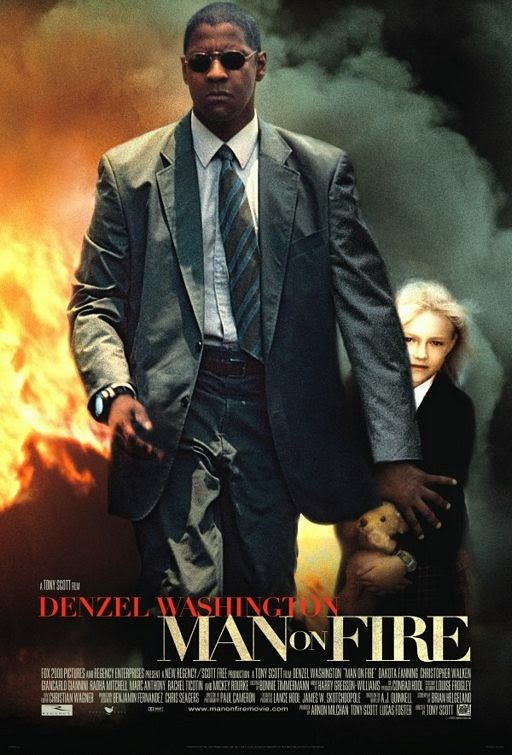
Tony Scott’s gut-wrenching revenge fantasy remake features the most badass Denzel Washington performance ever, along well as one of moviedom’s most interesting and elaborate use of on-screen subtitles.
Practically every scene features somebody from south of the border speaking in their own tongue, and the subtitled text will often slide across the screen or change size for dramatic effect. For extra important scenes, the subtitled translations are revealed word-by-word, in cadence with the characters’ furtive conversations.
During particularly intense moments when our hero’s blood is boiling, the dancing subtitles do all of these things at once, coming alive with the searing immediacy of a brightly burning fuse. Other than the musical interludes in the original Willy Wonka when the Oompa-Loompa lyrics are accompanied by animated sing-along subtitles, I’ve never seen anything quite like it in any other movie before or since.